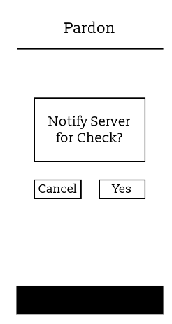
A software interface ‘Pardon’ that allows restaurant customers to alert their server in real-time with their needs.
Role: UX Designer and Researcher
Tools: Figma
Research & User Personas
Concept Statement
Interaction between a server and a patron in a restaurant is an important aspect of the experience of a dine-in restaurant. However, it is not always feasible to get the attention of your designated server in a time of need. Based on models of customer satisfaction and service times, the process of interaction could be streamlined by the customer having a way of alerting their server to their needs.
Exploratory Research
Conducted 8 interviews and received 52 questionnaire responses.
Users were frequently frustrated with difficulty getting their server’s attention. (96% of users reported having issues)
Users were seeking a balance between technology and human interaction - technology has its benefits and issues.
55% of responders benefited from technology, but 57% reported issues.
“I think you can easily replicate convenience but you’re never going to be able to replicate that relationship or wholeheartedness that you feel through the interaction.”
-Participant 1
Proposed Solution
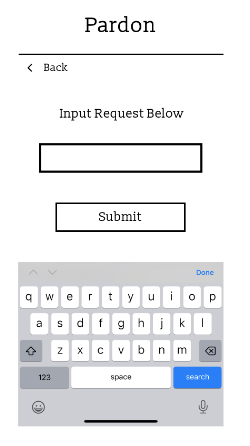
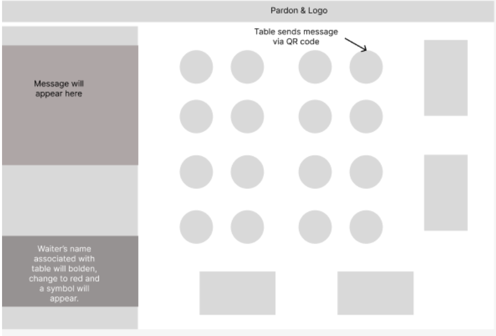
Pardon is a QR code generated website that connects to a server interface.
Allows customers to alert their server of their needs through the technology, without losing the customer-server interaction expected from a dine-in restaurant experience.
With Pardon, users will have the ability to alert the server of their needs within the optimal time frame, strive to improve the efficiency of the restaurant and improve the experiences of not only the customer but the workflow of the employees.
User Personas & Journey Map
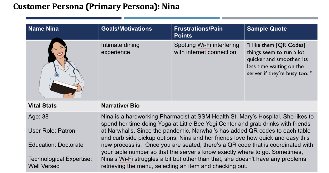
User personas were created from user research to further my understanding of the target audiences’ needs and to ultimately improve their dining experience. Nina, a patron, shared her insight regarding the convenience of QR codes and appearance of a well organized staff as a result. Jack, a server, noticed how neglectful he can become during busy shifts. However, he has a desire to improve the quality of his service and believes technology can play a significant role. These insights helped guide the design process.
User Journey Diagram- Patron
Base on the Task Flowchart, I developed a user journey map for both Patrons (left image) and Server (image below). This image shows the possible user flows and actions performed through the interface of the patron’s software.
Task Hierarchy Flowchart
To the left, contains the Task Hierarchy Flowchart. Which details the task flow from scanning the QR code to the server fulfilling the request. I decided to create a Task Flowchart because I’m a visual learner and its essential to view the breakdown each task. Viewing the breakdown allowed me to understand the relationship between them in order to create a user journey and prototypes. This Flowchart was generated in FigJam.
User Journey Diagram- Server
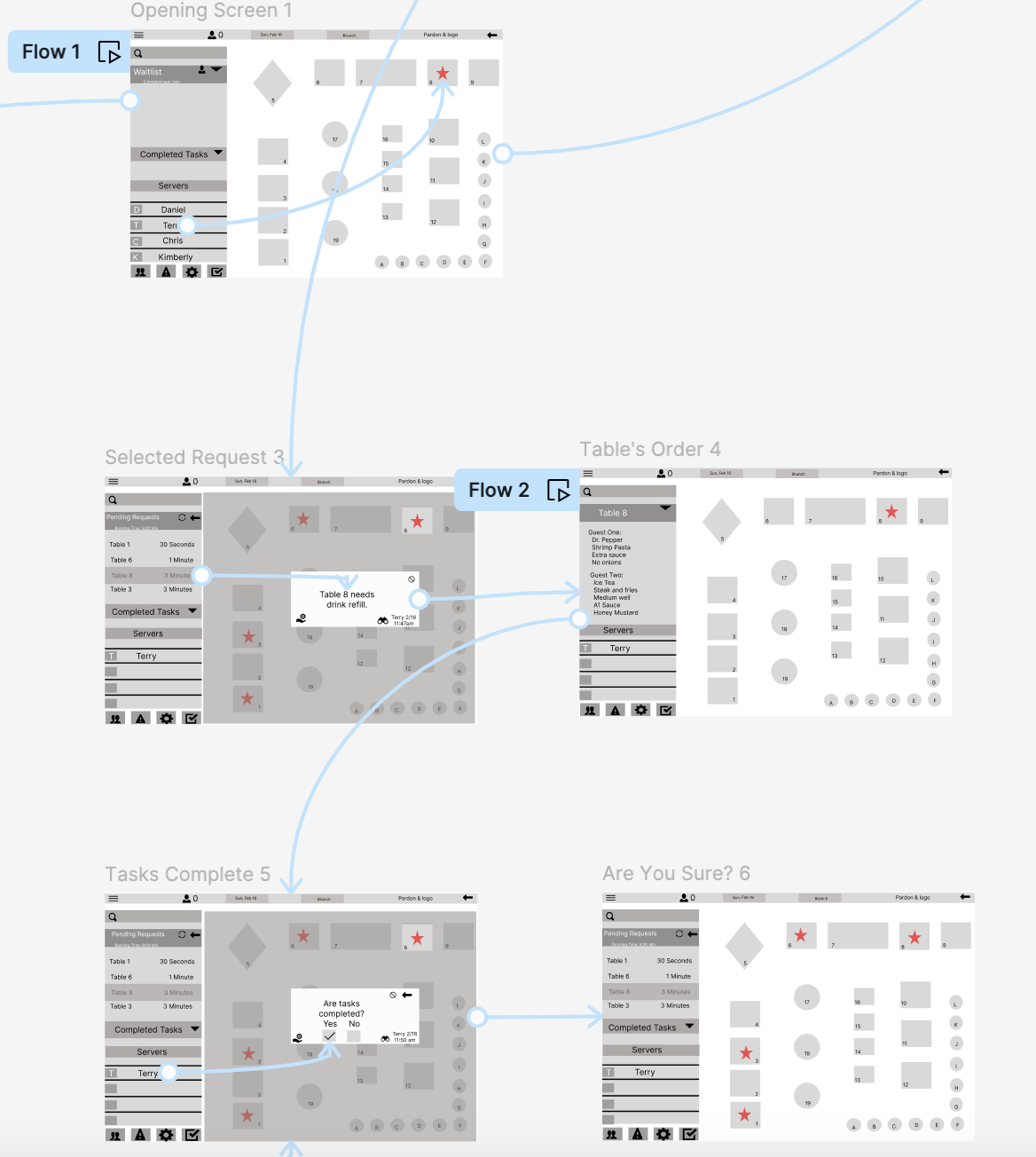
At the left presents the potential user journey of the server once a notification request is made by the patron.
Patron Prototypes & Heuristic Evaluation
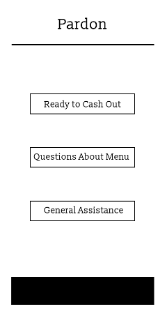
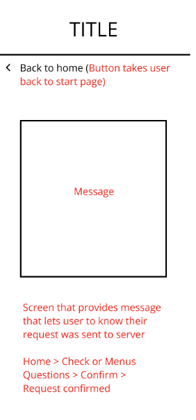
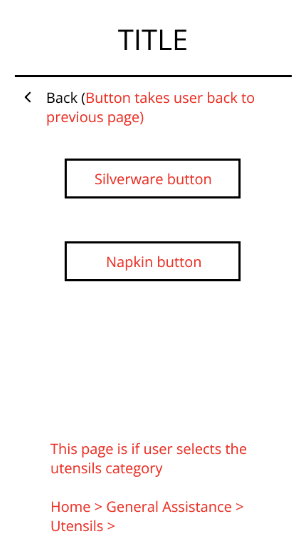
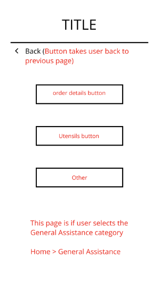
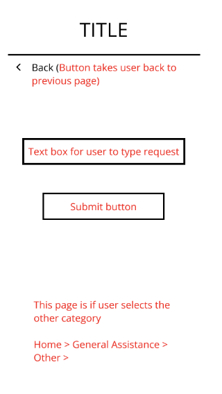
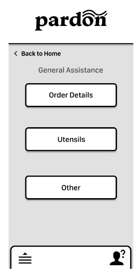
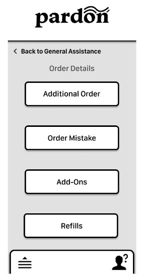
The main categories of options at the start are "Ready to Cash Out" , "Questions About Menu", and "General Assistance". These are three categories that are broad enough to fit most consumer needs into, and as the button is pressed, more options will be prompted. I decided to analyze the Low-Fi Prototypes with a heuristic evaluation to provide early detection of problems and to manage any gaps of the user experience.
Low-Fi Prototypes - Patron
Structured Inspection: Insights - Patron
Strengths: (.1 - .2)
Match between system and real world
Consistency and standards
Error prevention
Aesthetic and minimalist design
Help users recognize, diagnose, and recover from errors
Pleasurable and respectful interaction
Weaknesses (.5 - .8)
Visibility of system status
User control and freedom
Recognition rather than recall
Flexibility and efficiency of use
Help and documentation
Mid-Fi Prototypes - Patron
Server Prototypes & Heuristic Evaluation
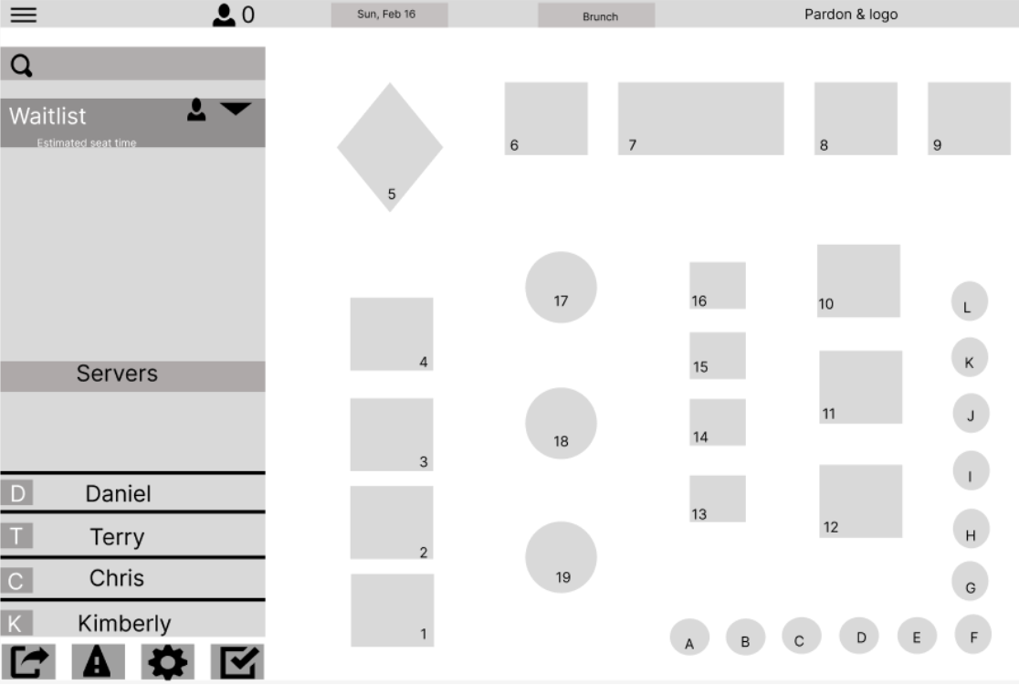
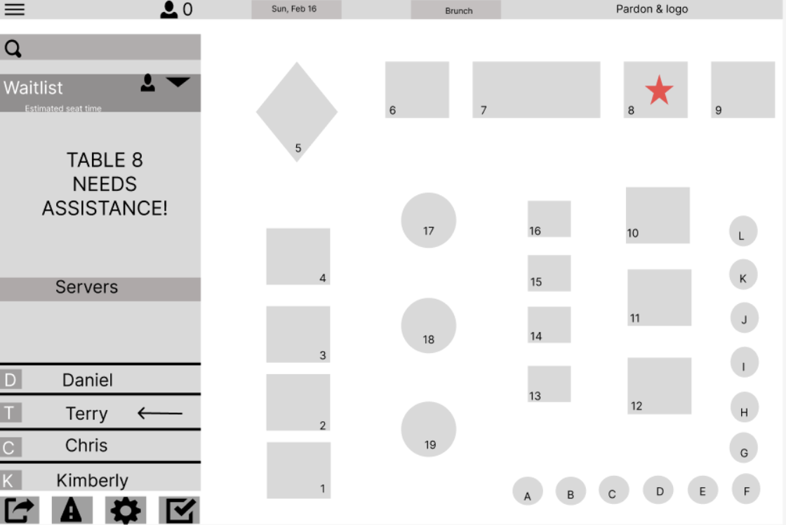
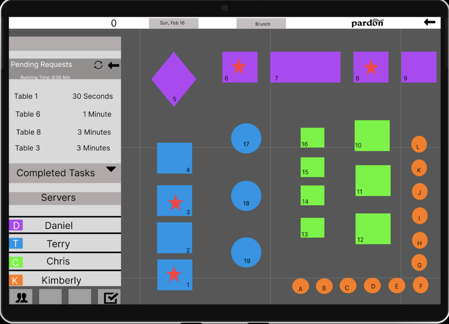
The Heuristic Evaluation reveled that Pardon does not have any availability for error messages on the server system, therefore, providing better visibility in the state of the system could help identify any potential issues. In order for severs to recognize and recover from errors, I decided to implement a completed task section and color coordinate tables. The Heuristic Evaluation section reflect these changes.
Low-Fi Prototype: Server
Structured Inspection: Insights - Patron
Strengths: (.1 - .2)
Match between system and real world
Consistency and standards
Error prevention
Aesthetic and minimalist design
Help users recognize, diagnose, and recover from errors
Pleasurable and respectful interaction
Weaknesses (.5 - .8)
Visibility of system status
User control and freedom
Recognition rather than recall
Flexibility and efficiency of use
Help and documentation
Mid-Fi Prototype: Patron
Heuristic Evaluation Results
Based on the heuristic evaluation, the following changes were implemented:
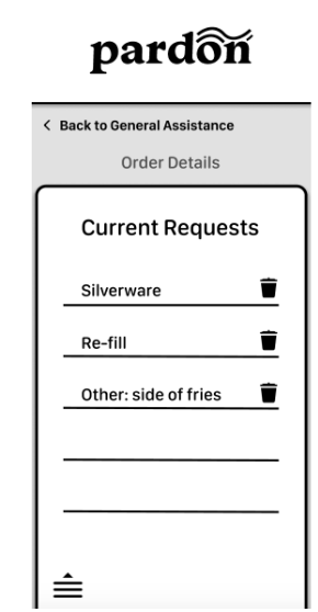
Allow users to delete requests
Create access for users to to receive help and instructions and signage to communicate where they are in the process
Color-coded tables were added to lessen any confusion and provide restaurant staff the ability to easily locate their jurisdiction.
The "Are You Sure" prompt has been removed. After the user completes the task, it will move directly to the completed tasks menu.
Final Design Updates- Patron
Changes Made: Based on Heuristic evaluation
Visibility of System Status
Added section for current requests
Allows user to delete request
Final Design Updates- Server
Help and Documentation
Added a help section and instructions section
Error Prevention
Cancel button added, completed tasks section
Changes Made: Based on Heuristic evaluation
User Control & Freedom
added a check mark and a back button
Recognition rather than recall
Added titles to signify where user is in the system
Recognition rather than recall
Pending requests and completed tasks
Help and Documentation
helps user troubleshoot issues
Key Learning
Creating this QR code based system, has broaden my understanding of the needs of the user on both sides of the restaurant industry. I learned that each user's needs are different from another, and that a successful system should be able to cater to a range of needs.
Key Learnings
Throughout the duration of this project, I gained valuable insight into the use of the D School Framework.
It was interesting to see the development of what started at an idea and ended in a working prototype, considering user input and research.
This project also served as good experience working in a group and meeting deadlines
